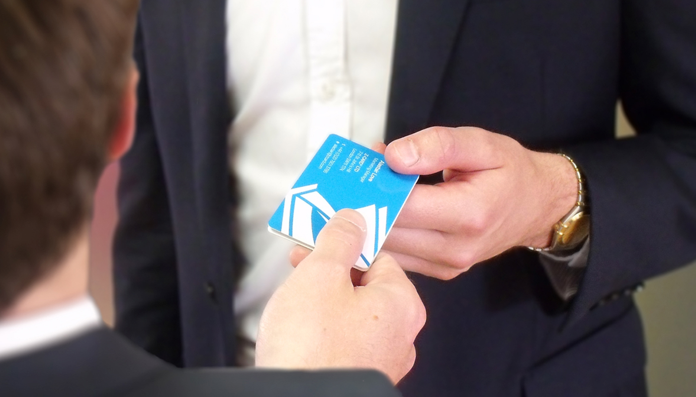
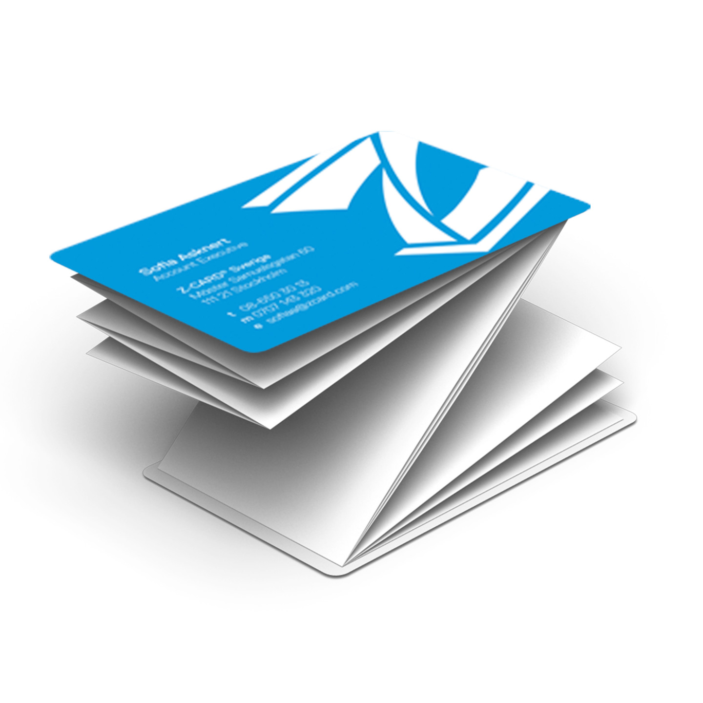
Z-CARD® wanted a new business card design, which would work in synergy to their website. It should introduce the brand and product to new clients, and at the same time remind existing customers of the range of possible applications of their product.
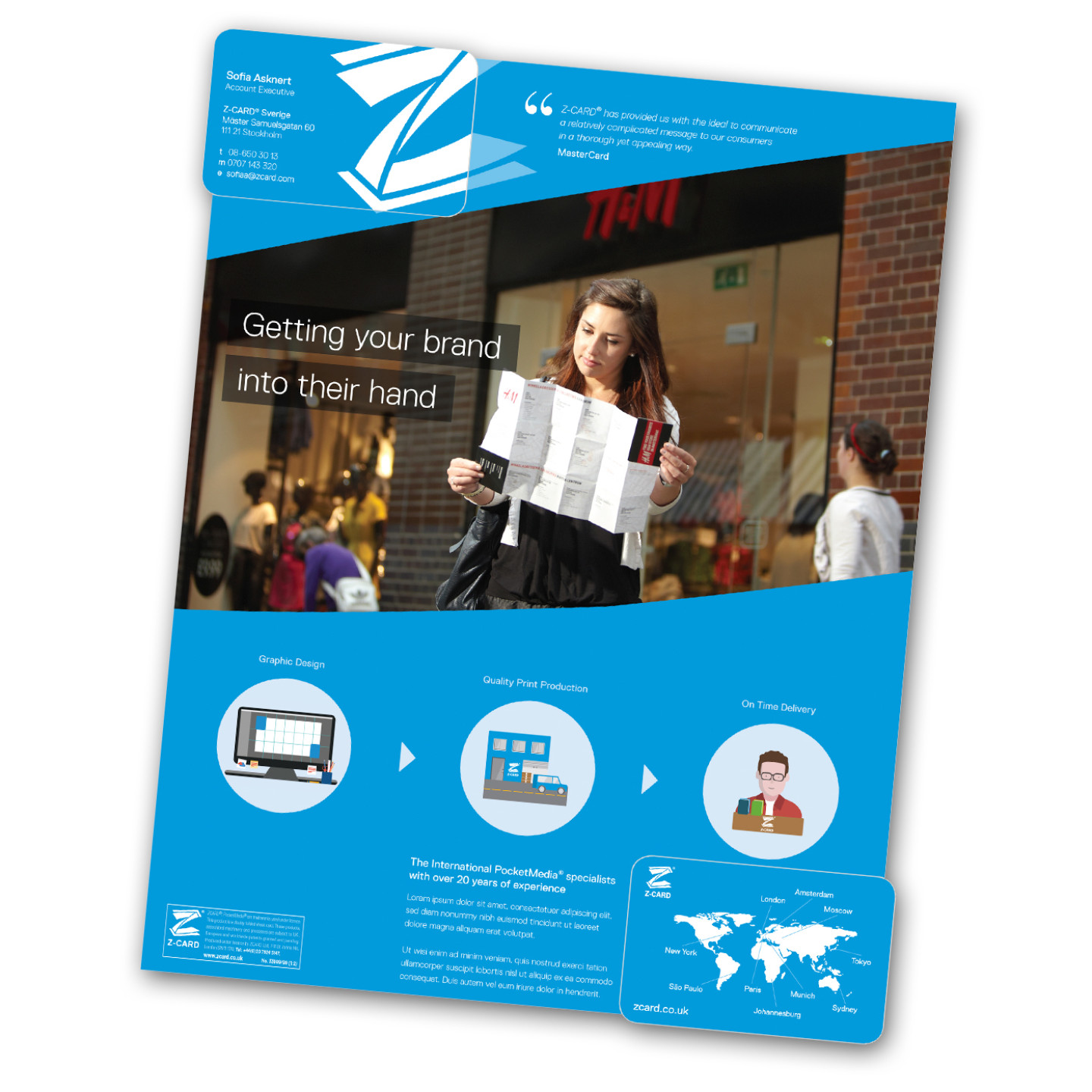
I have used the reading pattern of the format to structure the information and delivery it as visual story. Starting with the front cover of the business card, its logo would then expand into the front insert which opens with a testimonial of a well know client, stating the opportunity Z-CARD® has provided them with. Below a poster like layout welcomes the reader, revealing the size of the medium as well as the services the agency can provide the client with. A paragraph on the bottom extends on the map of the back cover reassuring this is an international company with experience.
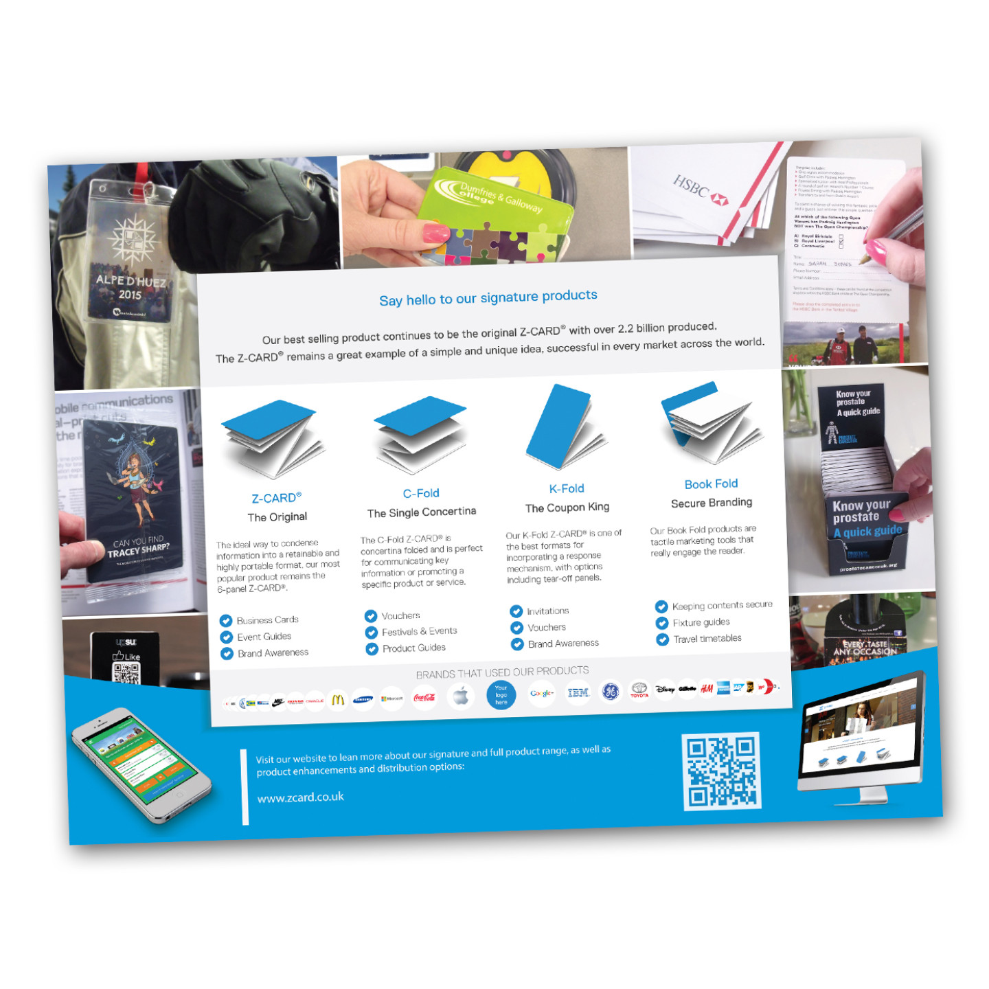
While the front works as an introduction to the company, the back insert focuses on the product range with the signature products in the center and various distribution options photographically displayed around it. Bullet points under the signature products sparkle the reader interest by listing the range of applications that are possible with the medium. The hierarchical display of the top brands underneath, which have used the products previously, then only confirms the readers interest. A prominent call to action on the bottom of the page then prompts the reader to visit the website for more information.
Z-CARD® was extremely happy with the outcome, as it stood out from their previous business card designs, and followed the principles of the website, with a strong focus of delivering information visually, and keeping text to a minimum.
