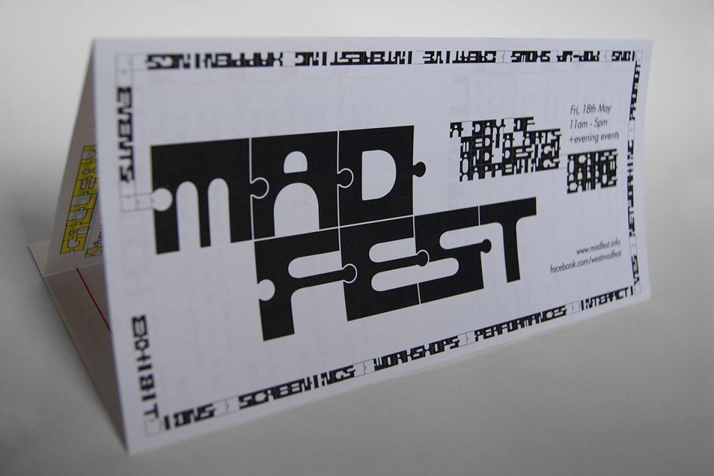
The organisers of ‘MAD-Fest’ (Media, Arts & Design) at the University of Westminster offered to pitch concepts of an identity for their yearly festival. The purpose of the event is to “break down the walls” of the school’s departments and give students the chance to share their work and ideas amongst each other, and encourage future collaborations.
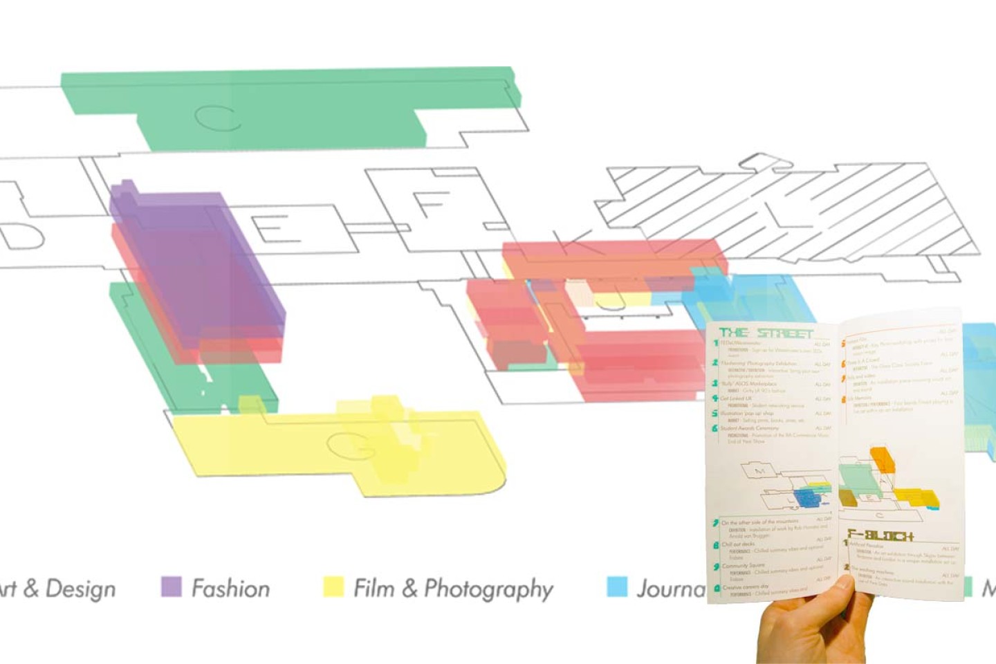
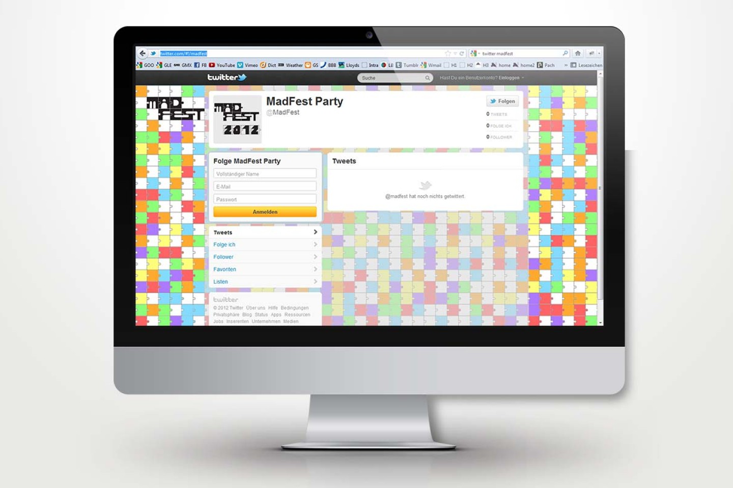
The concept of different departments coming together was reflected in the identity’s typeface, which could be applied on the program, way-finding system, social media accounts, and clothing for all participants.
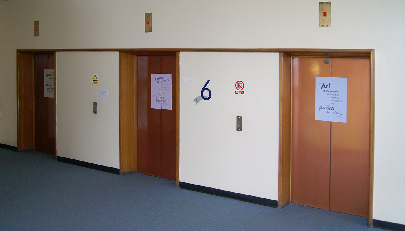
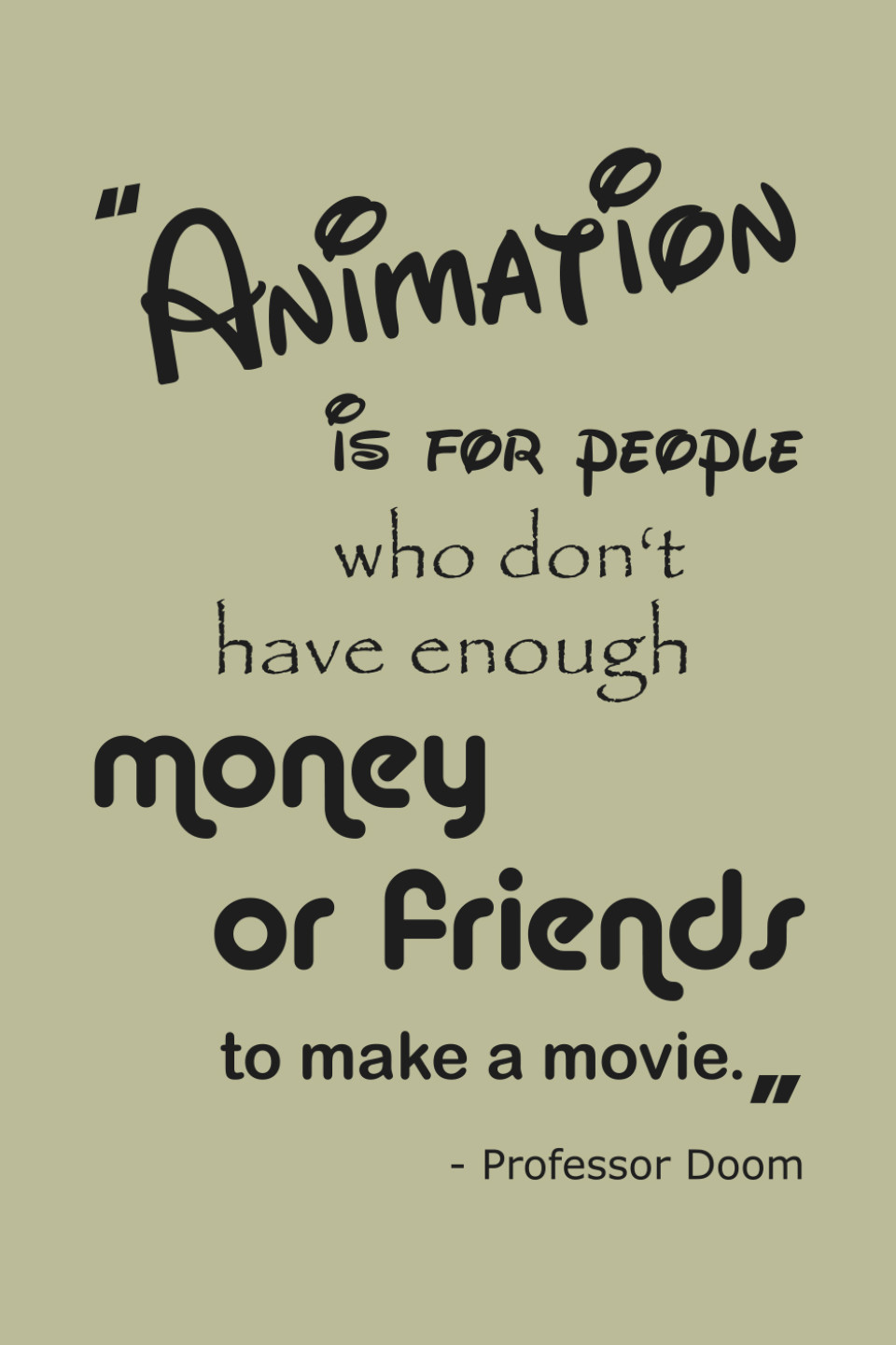
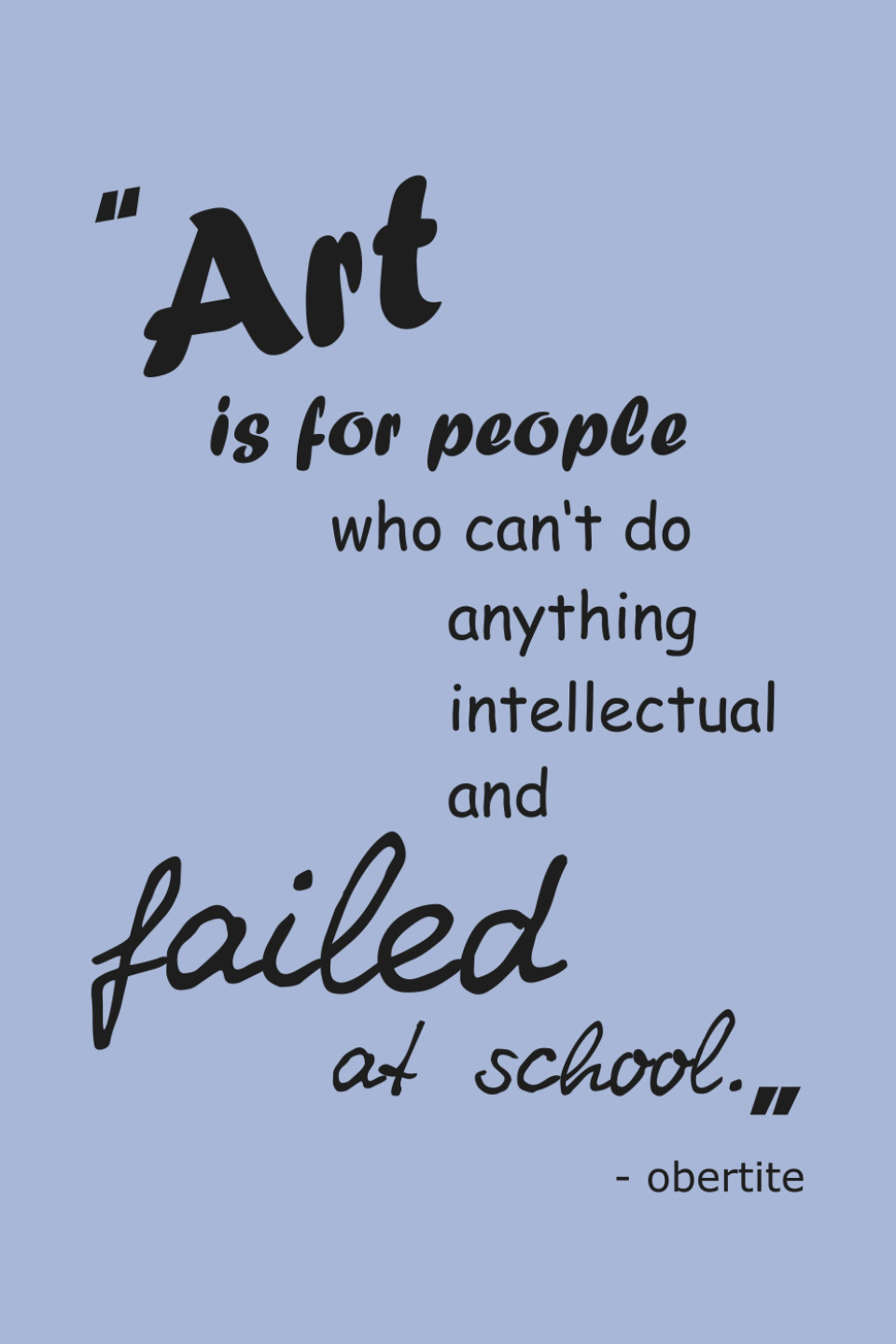
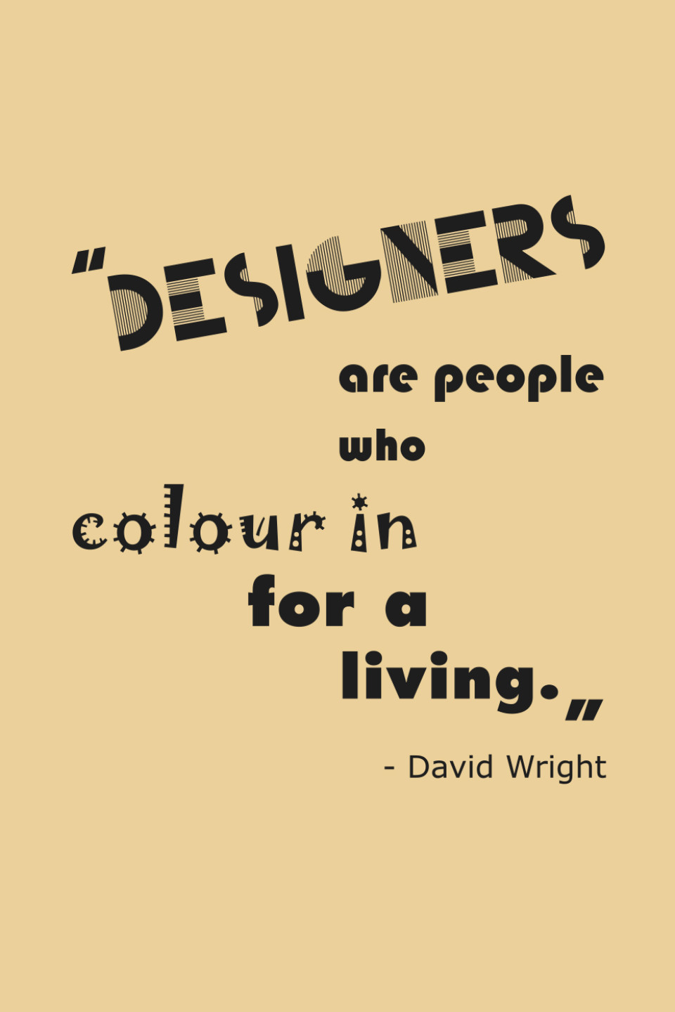
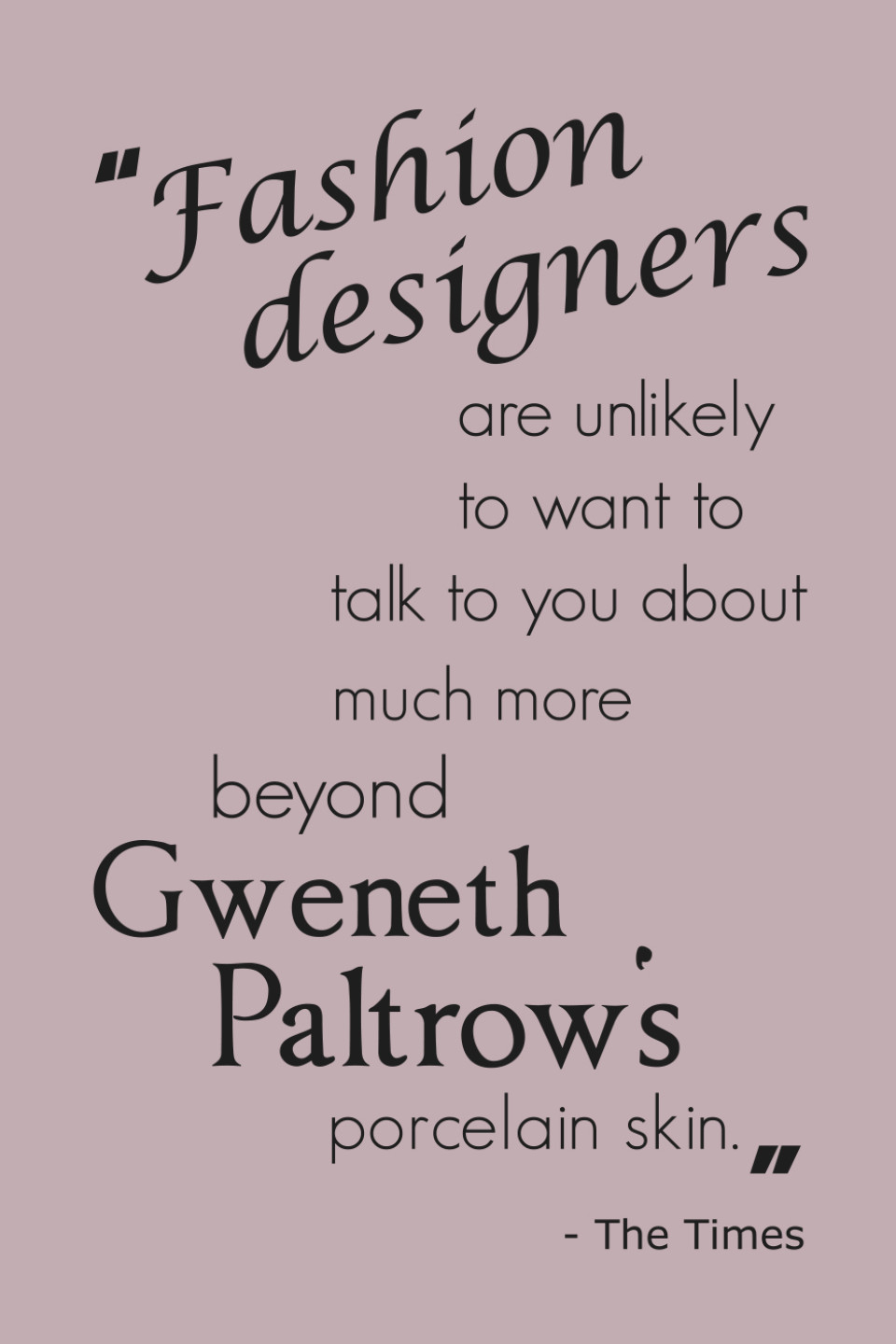
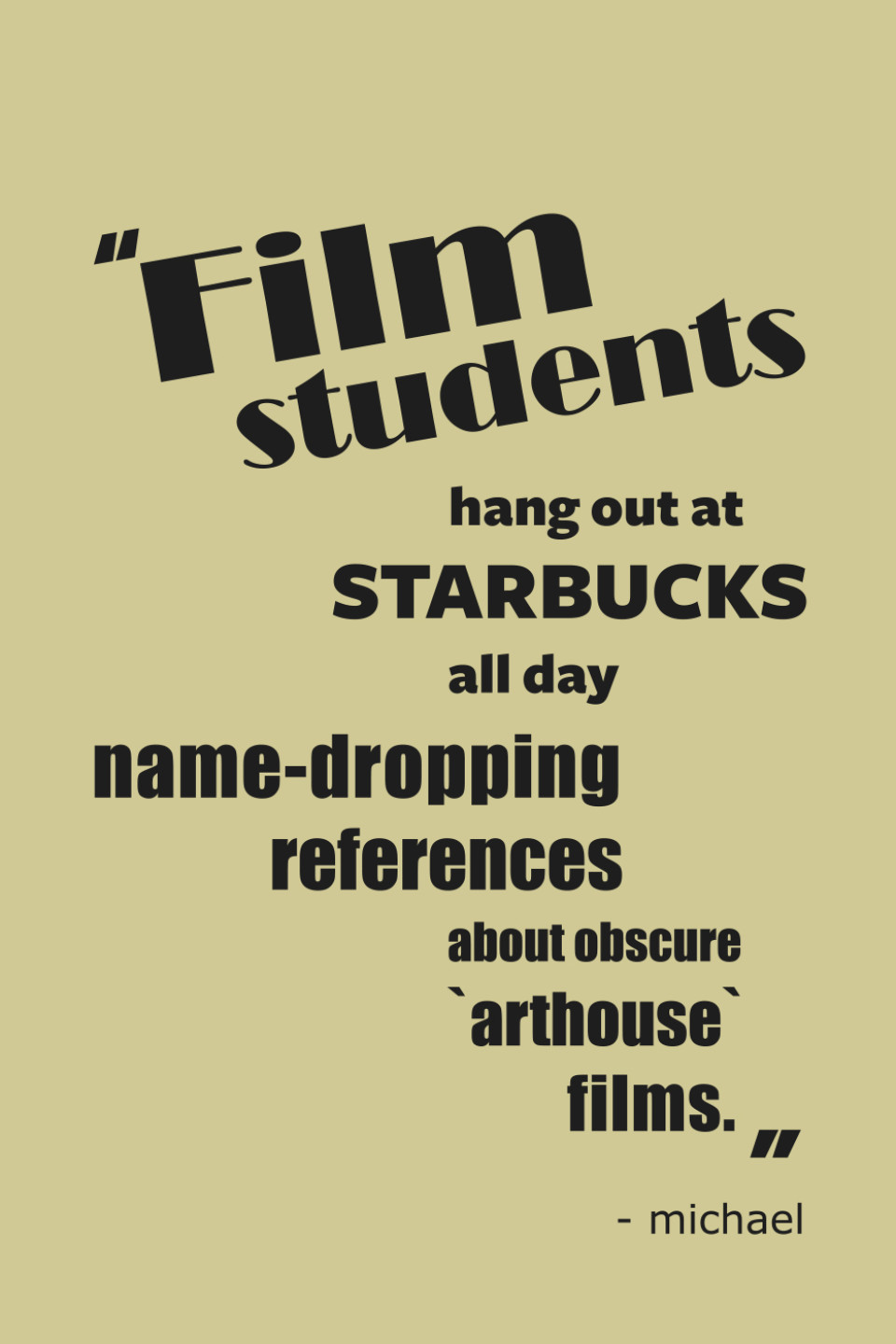
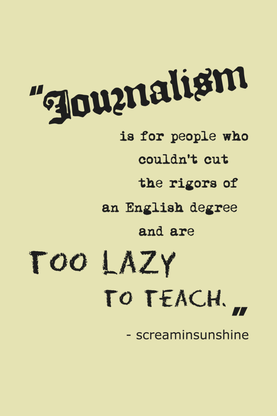
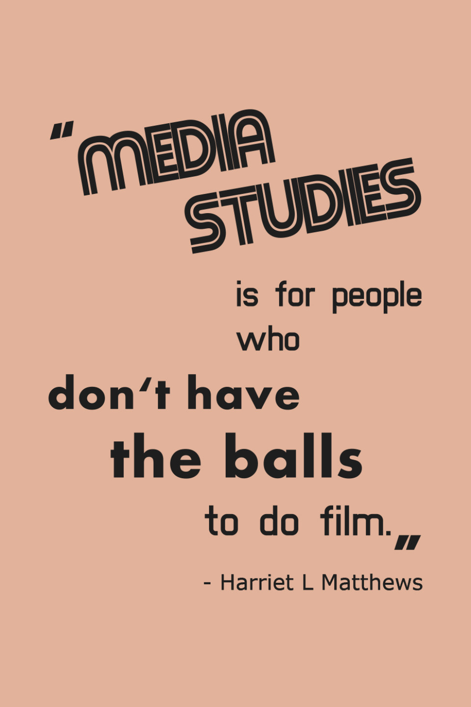
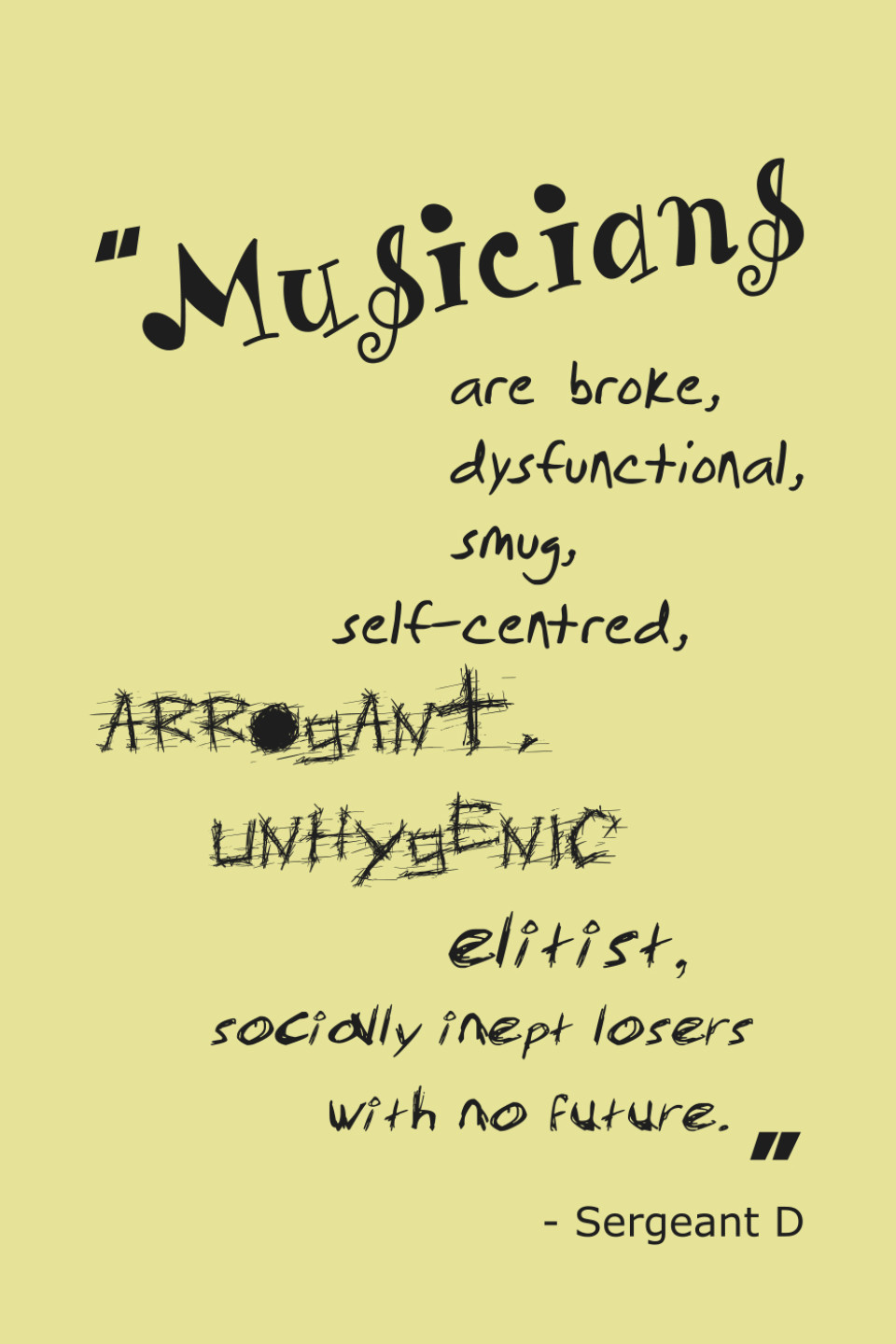
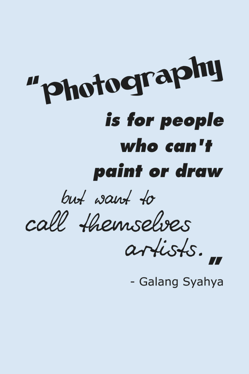
To promote the event, I designed a series of posters, which featured quotes found on the internet stating typographically supported stereotypical views on students’ area of study. The idea was to provoke students thoughts on this matter and using ‘MAD-Fest’ to refute stereotypes about themselves, but also question own views on studies of other students. By hanging up the posters on doors leading to a specific department, the poster and therefore the stereotype would be metaphorically and literally broken, if someone enters.
While the overall visual identity did not get picked by the organisers, the concept of the posters was received highly positive. Therefore I was asked to exhibit those during the event, by placing them inside and outside the lifts leading in the center of the event.
