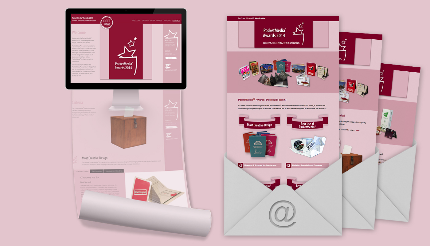
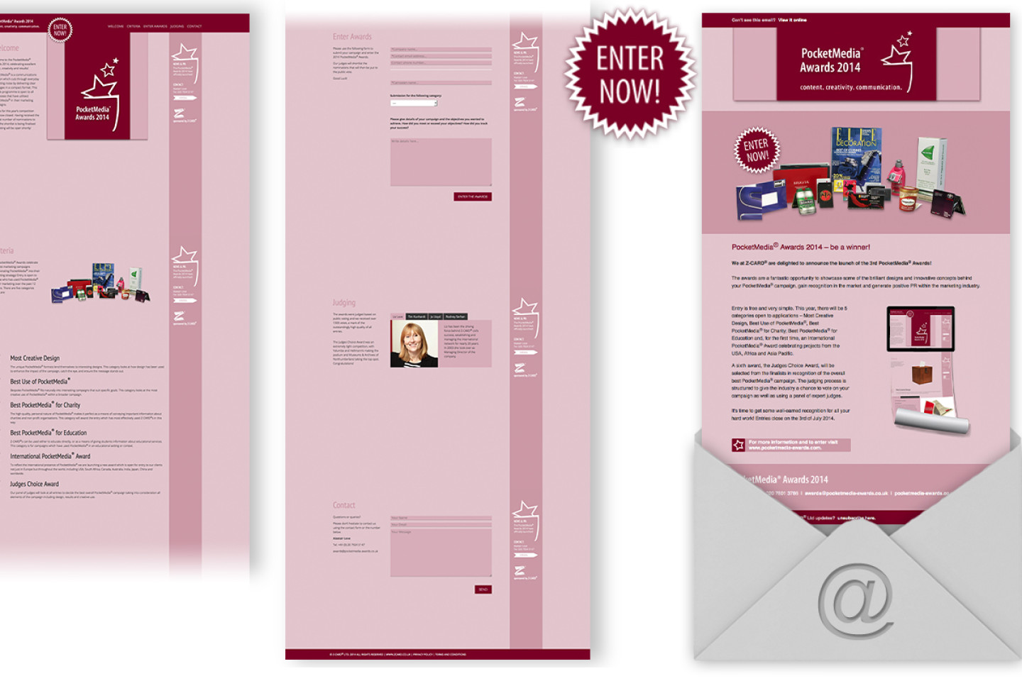
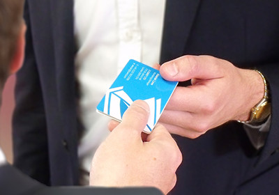
Z-CARD® has tasked me to redesign and develop the website for their yearly PocketMedia® Awards. The award consists of three stages, which encourages clients to submit their own projects, vote for them, and eventually the winners get announced. Furthermore HTML-emails needed to be designed to inform participants and encourage visitors to visit the award website.
After analysing their old website I suggested to present all necessary information on one page in order make it more transparent and taking clients doubts of participating. The one pager made reading more pleasant by reducing clicks and therefore avoided breaking the reading flow by loading new pages. Furthermore I encouraged to push the use of stronger images to support text and keep it to a limit.
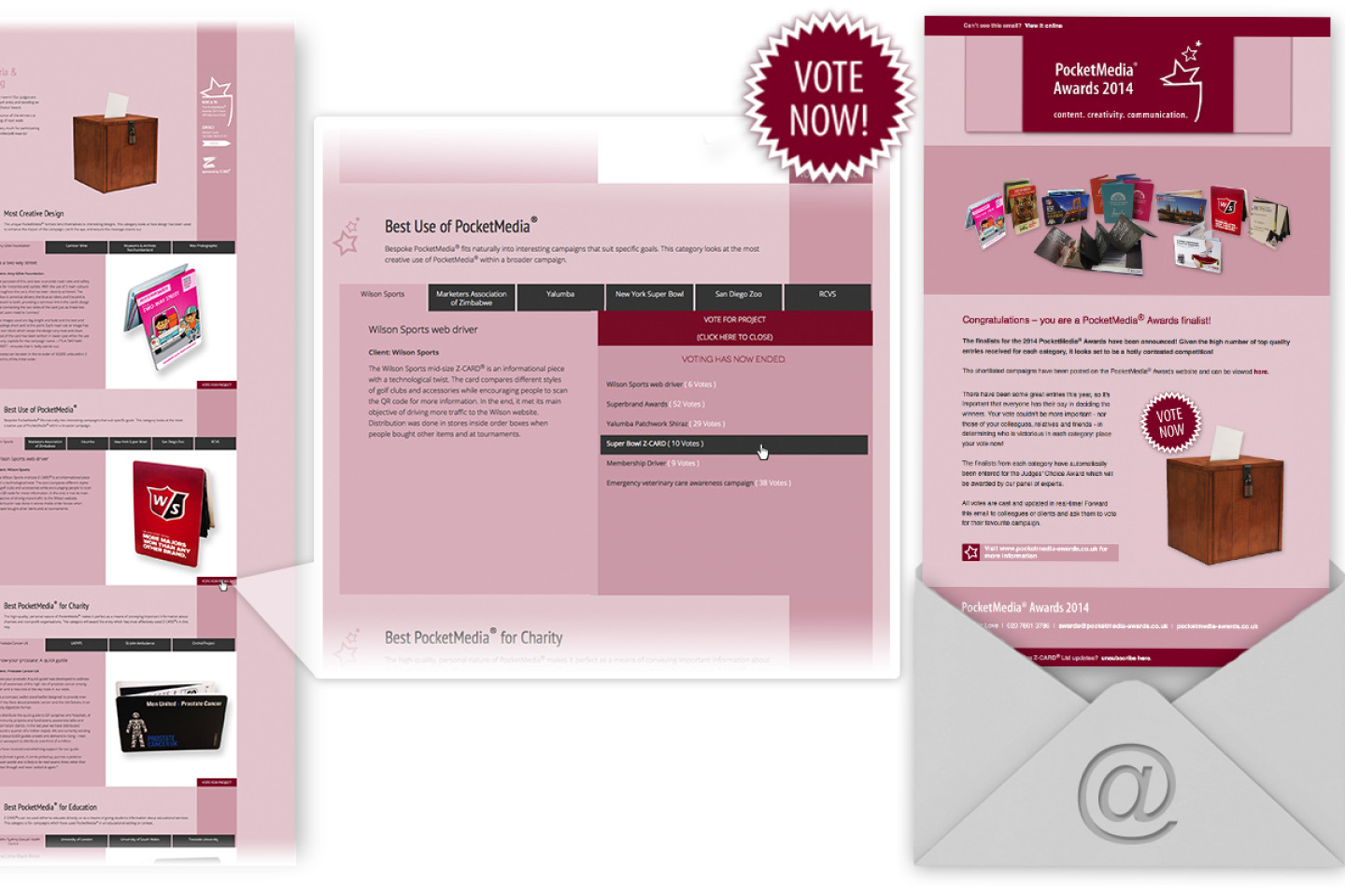
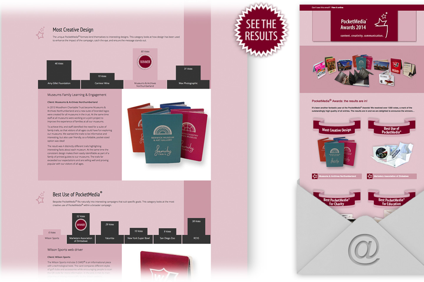
Stage 1 introduced the four criteria sections, which extended in Stage 2 and featured submitted clients’ projects for each criteria for which visitors could immediately vote. By adding a tabbing menu scrolling was kept to a limit and the reader didn’t get overwhelmed with information about the project. The results in Stage 3 three were presented visually by turning the tabbing menu into a diagram.
Z-CARD® was very pleased with the website and HTML-Email design and had the highest participation of clients and voters since they started the awards.

